Welcome
Welcome to this guide.
Brand is the feeling someone has after twenty seconds with you. This guide helps you build that feeling on purpose.
Most studio brands are accidental. The logo was made by a friend in 2014. The colour palette grew by accident, one social post at a time. The tone of voice on the website is formal, the Instagram captions are chatty, and the term newsletter sounds like it was written by a different school entirely. Parents notice the wobble, even if they could not name it.
By the end of this guide, you will have a clear, simple brand cheat sheet for your studio. A palette, a typeface pairing, three tone-of-voice words, a photography style, and a one-page summary you can hand to a designer, a photographer, or a new front-of-house staff member.
How to use this guide
Read it through with a coffee, then come back with a notebook (or your notes app) and work the exercises. The brand cheat sheet later on is the one to save somewhere your team can see it. Everything else feeds into it.
Who this is for
- Studios with a logo and not much else written down
- Schools planning a rebrand or a website refresh
- Owners who want their brand to feel consistent everywhere
- Anyone briefing a designer, photographer, or social manager
Contents
What's inside.
Part One
Foundations
The five decisions underneath every confident brand. Colour, type, voice, story, photography. Get these right and everything else falls into line.
Chapter 01
Brand is more than your logo.
Your logo is a name tag. Your brand is the impression people walk away with. Those are not the same thing.
Most studios spend their brand energy on the logo and almost none on the rest. Then the website does not feel like the Instagram, the Instagram does not feel like the foyer, and the foyer does not feel like the Friday email.
The six things that make a brand
Colour palette
A tight set of colours used the same way every time.
Typography
One display font, one workhorse. Both legible on a phone in sunlight.
Photography style
A consistent treatment. Light, framing, what's in shot.
Tone of voice
Three words you can hold the line on.
Logo and marks
Clean, scalable, with light and dark variants.
The story
Why your school exists. The bit no competitor can copy.
Mindset shift
Think of your brand as a feeling that follows a parent from Instagram, to website, to foyer, to Friday email. The feeling should be the same in all four places.
Chapter 02
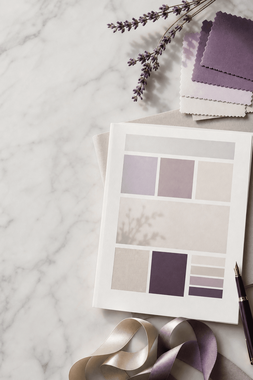
The brand cheat sheet.
Everything you need to keep your brand consistent fits on one page. Most studios do not have that page yet. By the end of this guide, you will.
What goes on the cheat sheet
- 01
Brand promise
One sentence that says what you stand for. The thing every choice ladders up to.
- 02
Colour palette
Primary, accent, two or three neutrals. Hex codes for digital.
- 03
Typography
Display font for headings, body font for paragraphs. Web and email fallbacks.
- 04
Tone of voice
Three words and a short paragraph showing how it sounds in real sentences.
- 05
Photography style
Three reference images. A short list of dos and don'ts.
- 06
Logo usage
Primary, secondary, mono. Minimum size. Clear space. What never to do.
If a new starter joined tomorrow, could they design a flyer that looked like yours, using only this page? That is the test.
Chapter 03
Choosing colours that work everywhere.
Your colours need to look good on a phone screen, a printed flyer, a vinyl banner, and a leotard label. Pick them with that in mind.
The simple palette
- One primary. Your signature colour. Used for buttons, headings, and the logo.
- One accent. Used sparingly for highlights and CTAs. Should contrast with the primary.
- Two or three neutrals. Off-white, soft cream, charcoal. The backdrop.
- One success / one warning. Functional colours for forms and errors.
- Tints and shades. Lighter and darker versions of your primary for depth.
Practical tests before you commit
- The primary has enough contrast against white for body text to be readable
- The accent pops next to the primary without clashing
- The palette still looks good in greyscale
- Nothing in the palette resembles a major competitor's primary colour
Cheap test
Mock up a square Instagram post, a flyer, and a website hero in your palette. Print them. Pin them on the wall for a week. Most palette wobbles reveal themselves in the first three days.
Chapter 04
Typography for legibility and personality.
Fonts carry tone before a single word has been read. Pick two, use them everywhere, and your brand will feel pulled together overnight.
The pairing rule
One display font for headings, with personality. One workhorse font for body. Two fonts is plenty. Four is a sign nobody is in charge.
What to look for
Display font
Has character. Used for headlines and page titles. Should match your tone.
Body font
Legible at small sizes. Has proper weights. Works on phones and printed letters.
Web-safe fallback
A system font that takes over if your web font fails to load.
Email-safe fallback
Custom fonts often fail in email. Have Arial, Helvetica, or Georgia on standby.
Pairing checklist
- Headings and body are clearly different but feel related
- Both fonts have licensed web versions you can legally use
- Body font is 16px minimum with comfortable line height
- Italics and bold are used sparingly, for emphasis only
Chapter 05
Tone of voice: pick three words.
Tone of voice is what you sound like when you are at your best. Most studios have a tone already. Few have ever written it down.
The three-word exercise
Pick three adjectives that describe how you want to sound. Common combinations for dance schools: warm, precise, encouraging. Or playful, expert, honest. Or calm, confident, kind.
Make each word do work
- 01
Define it
"Warm" means we write the way we would speak in the foyer. Not stiff. Not slangy.
- 02
Show it
Give two example sentences for each word. One that nails it. One that misses.
- 03
Limit it
Note what your voice is not. "Warm" is not "saccharine". "Confident" is not "boastful".
The fridge test
Write your three words somewhere visible — the studio fridge, a sticky note on your laptop, the top of the staff Slack. Before sending the Friday newsletter, glance up. Does this sound like those three words?
Chapter 06
Your brand story.
The story is the bit no competitor can copy. Why your school exists. What you believe. Who it is for. Get it written down once and use it everywhere.
The four parts of a useful story
- 01
Origin
Why the school started. A real moment, not a corporate mission statement.
- 02
Belief
What you think dance is for. The thing that shapes every class.
- 03
Who it is for
The kind of student and family who thrive with you.
- 04
What's different
The one or two things you do that nobody else nearby does.
Where the story shows up
- The first paragraph of the About page
- The bio on Instagram and Facebook
- The welcome email a new family receives
- The first thirty seconds of any spoken pitch
Write it as you would tell it to a friend over a coffee. Then trim. Story beats polish, every time.
Part Two
Look and Feel
Now to put the foundations to work. Photography, briefing a designer, and applying the brand everywhere it needs to show up.
Chapter 07
Photography style.
Photography is the biggest brand cue parents pick up. A consistent feel across every image makes a studio look like one that knows itself.
What "a style" means in practice
Light
Natural or studio? Bright and airy, or moody? Pick one.
Framing
Close action, wider group, or both? How much of the space shows?
What's in shot
Real students in your uniform. Avoid stock dancers.
Post-processing
A consistent edit. Apply it to every image.
Photography checklist
- I have three reference images that show what "on brand" looks like
- I brief the same way every shoot, year on year
- Photography consent is on file for every student shown
- No image on the public site is older than 24 months
Chapter 08
How to brief a designer well.
Designers cannot read your mind. Vague briefs produce vague designs and a lot of back-and-forth.
What to put in your brief
- 01
Who you are
One paragraph on your school, audience, and what makes you different.
- 02
The job
Be specific. "Logo, website, signage" is three jobs, not one.
- 03
The brand cheat sheet
If you have it, share it. If not, say so honestly.
- 04
Three references
Three brands whose look you admire, with a sentence saying why.
- 05
Three anti-references
Three brands you specifically do not want to look like.
- 06
Practicalities
Budget range. Deadline. Who decides.
Questions a good designer will ask
- Who is your primary audience, and what do they care about most?
- What three words describe how your brand should feel?
- Where will this brand show up most: web, social, print, signage?
- What do you not want it to look like?
Chapter 09
Applying brand to your website.
Your website is the place your brand has to behave under pressure. Buttons, forms, navigation. It all has to hold up.
Where brand shows up on a site
- Header and logo. Clean, scaled correctly.
- Buttons. Primary and secondary, used consistently.
- Headlines and body. Brand fonts, consistent sizing.
- Forms. Clean labels, brand-coloured focus states.
- Microcopy. Page titles, button labels, alt text.
- Empty states. Even "no results" should feel like you.
Website brand checklist
- Every button uses one of two styles (primary or secondary)
- Headings use the same two-font pairing on every page
- The colour palette is documented in your stylesheet
- Microcopy sounds like your tone of voice
Chapter 10
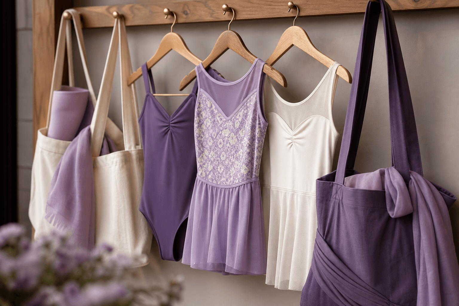
Brand on social, uniform and signage.
Parents meet your brand in a dozen places before they visit. Every one of those places should feel like the same studio.
Social media
- A consistent profile picture and bio across every platform
- A simple visual treatment for posts (templates, fonts, palette)
- Captions in your tone of voice, not the auto-generated suggestion
- Photography style that matches the website
Uniform
- Brand colours used in trim, leotards, t-shirts, or hair accessories
- Logo applied at a sensible size, not stretched across a sleeve
- A consistent supplier for staff t-shirts so the colours stay true
Signage and print
- Studio frontage signage in the right palette and font
- Welcome boards and posters that match the website style
- Term letters and flyers with the same hierarchy as digital
- Internal signage (changing rooms, viewing area) in the same look
Chapter 11
The annual brand audit.
Brands drift. New social platforms, new staff, new suppliers, a quick redesign of the term letter. Once a year, sit down and check the drift before it becomes a wobble.
The ninety-minute audit
- 01
Open ten touchpoints side by side
Homepage, about page, contact page, Instagram grid, Facebook page, a term newsletter, a trial confirmation email, a flyer, the studio frontage, a uniform t-shirt. Ten tabs and ten photos.
- 02
Look for wobble
Different fonts? Different colours? Different tone? Any photo that does not look like the rest? Note every one.
- 03
Score against the cheat sheet
Which touchpoints are fully on-brand? Which are nearly there? Which are completely off? Be honest.
- 04
Pick three fixes
Not ten. Three. The ones that will make the biggest visible difference. Book them in.
- 05
Refresh the cheat sheet
Update the master document with anything that has changed. Re-share it with the team. Make sure suppliers have the new files.
Annual audit checklist
- The brand cheat sheet exists and is up to date
- Every public touchpoint has been reviewed against it in the last 12 months
- Staff know where to find the brand assets when they need them
- Suppliers (uniform, signage, print) have the latest colour and logo files
- The three biggest brand fixes for the year are scheduled, not theoretical
Chapter 12
Logo basics: getting the details right.
Your logo is the smallest part of your brand and the part most often abused. A few rules keep it looking sharp wherever it shows up.
The files you actually need
- Primary logo. Full colour, on a light background.
- Reversed logo. White, for use on dark or photo backgrounds.
- Mono logo. Single colour, for print and fax-style use.
- Logo mark. An icon-only version for social profiles and favicons.
- Vector files. SVG, EPS, PDF. Never resize a JPG of your logo.
Rules to write down
Minimum size
Below this size the logo becomes a smudge. Usually around 24px tall on screen.
Clear space
A buffer of empty space around the logo. The height of one letter is a good rule.
What never to do
Do not stretch, recolour, rotate, or add effects. The logo is the logo.
Where it sits
Top-left on websites. Centre on social profile pictures. Consistent everywhere.
Chapter 13
Microcopy and the small words.
Buttons, form labels, confirmation screens, error messages. The small words people read once and either smile at or scroll past.
Where small words make a big difference
- Button labels. "Book my child's trial" beats "Submit".
- Form fields. Friendly, specific labels. "Your child's first name" beats "Name".
- Empty states. "No classes this week, here's next week" beats a blank page.
- Error messages. Helpful, never blaming. "Looks like the date is missing."
- Confirmations. Warm and clear. "We've got it. We'll reply by Friday."
- Email subject lines. Short, human, never "RE: enquiry #4827".
The three-word rule
Read every button label and ask: does this sound like one of my three tone-of-voice words? If not, rewrite it. Microcopy is where tone of voice either holds or quietly falls apart.
Part Three
Worksheets
Two exercises to work through and save somewhere the team can see them. The cheat sheet, and a moodboard prompt to brief your next shoot or design.
Worksheet
Your brand cheat sheet template.
Capture every element in one place. The point is something a new starter or a designer can use without asking you a single question.
Worksheet
Moodboard and reference prompts.
Before any shoot, rebrand, or website refresh, fill this in. Hand it to your designer, photographer, or social manager. It saves at least one round of revisions.