
Welcome
Welcome to this guide.
This is the guide we wish every dance school owner had before they briefed their first web designer.
Most studio websites do not fail because the design is wrong. They fail because the planning never happened. Pages are added one at a time. Photos are uploaded in a rush. The contact form is buried. The trial booking takes seven clicks. Three years later the site is a patchwork that nobody, including you, fully understands.
The point of this guide is to put you back in control. By the end of this guide, you will have a clear picture of the pages your studio needs, the structure that supports them, and the small decisions that quietly drive whether a parent enquires or scrolls on.
How to use this guide
Read it in one sitting with a coffee, or work through it chapter by chapter with your team. The exercises and worksheets are there to be marked up. Print the planner pages and stick them above your desk. Tick the checklists as you go.
Who this is for
- Studio owners about to brief a new website
- Schools whose existing site has stopped working for them
- Marketing leads inside larger dance organisations
- Anyone who books trials, takes payments, or fields enquiries through a website
Contents
What's inside.
Part One
Foundations
Before the design, the platform, the photos or the launch. The five decisions that quietly determine whether the whole project works.
Chapter 01
Why your website matters more than you think.
Your website is rarely the first time a parent hears about you. It is almost always the moment they decide.
A friend mentions your studio. They see a flyer outside the church hall. Someone in the school playground says their daughter loved her trial. None of that closes the decision. The decision happens at 9:30pm on a Tuesday, on a sofa, on a phone, with the dishwasher running and a glass of wine to hand. That moment is your website.
What your website actually does
- Filters. The right parents stay, the wrong fit politely leaves. Both are wins.
- Reassures. Photos of real classes, real teachers, real spaces. The brain relaxes.
- Removes friction. Class times, pricing, what to wear, where to park. All answered before they ask.
- Builds the relationship. Tone of voice does what a flyer never could.
- Converts. A trial booked at 9:30pm Tuesday is worth as much as one walked in on Saturday.
Mindset shift
Stop thinking of your website as a brochure. It is a hard-working member of the team. Most studios would never hire a receptionist who hid the timetable, ignored questions, and looked uninterested. Yet that is exactly what most studio websites do.
Chapter 02
Goals and audience.
A website cannot serve everyone equally. The studios that win get specific.
The four audiences your site serves
New parents
Researching a first class. Need reassurance more than information. Want to see warmth, safety, and other children like theirs.
Returning students
Just need the timetable, the term dates, and the parent portal. Get out of their way.
Serious dancers
Looking for syllabus, exam track record, performance opportunities, and teacher credentials.
Local searchers
Found you on Google. Need to know where, when, how much, and whether to trust you. In under sixty seconds.
Exercise: rank your audiences
Which of the four matter most for the next twelve months? Number them 1 to 4. The number-one audience should shape every page choice that follows.
Chapter 03
Brand essentials.
Your brand is not your logo. It is the feeling someone has after twenty seconds on your website.
The five elements
- 01
Logo
A clean, scalable version for the web. Light and dark variants. Avoid uploading the JPG someone made you in 2014.
- 02
Colour palette
One primary, one accent, two or three neutrals. Document the hex codes. Use them everywhere.
- 03
Typography
One display font for headings, one workhorse for body. Both legible on a phone in sunlight.
- 04
Photography style
Real students. Real studio. Natural light. Consistent treatment. No stock photos that scream stock.
- 05
Tone of voice
How you sound when you are at your best. Warm? Precise? Playful? Pick three words and hold the line.
Quick brand audit
- I have an SVG or transparent PNG of my logo in both light and dark versions
- My brand colours are documented with hex codes
- I use no more than two fonts across my whole site
- The photos on my site were taken in the last 18 months
- My tone of voice is the same on the homepage, the about page, and my emails
Chapter 04
Information architecture.
The right pages, in the right order. This is the skeleton everything else hangs on.
You do not need fifty pages. You need a handful of pages that each do one job clearly. Most successful studio sites use a structure something like this:
The core nine
- Home. The promise, the proof, the route in.
- Classes. A page per discipline or age group.
- Timetable. When, where, how much.
- About. Your story and your standards.
- Team. The faces. Real photos. Short bios.
- Trials. One job: book a trial.
- Pricing. Clear, honest, with policies.
- Reviews. Or testimonials inline elsewhere.
- Contact. Multiple ways. Fast reply promise.
Optional, useful, often overlooked
- Frequently asked questions (slash trial day FAQ)
- What to wear and what to bring
- Performance and exam track record
- Holiday courses and intensives
- Blog or news (especially for SEO)
Tip
Every page should answer the question: if a busy parent only ever sees this page, what do they need to walk away knowing?
Worksheet
Sitemap planner.
Sketch your top-level pages. Use the boxes below. One concept per box.

Page 1 · Home
Page 2
Page 3
Page 4
Page 5
Page 6
Sub-pages and groupings
Group related pages. Classes might have Ballet, Tap, Modern, Acro as children.
Part Two
The Essential Pages
Page by page. What goes on each one, what to leave off, and the small details that move parents from curious to booked.
Chapter 06
The homepage.
Your homepage has roughly five seconds to answer three questions. Who are you? Who is this for? What do I do next?
Above the fold
- A confident, specific headline (not a slogan)
- A supporting sentence that names the audience
- One primary call to action (usually: book a trial)
- A photograph of real students in your studio, not stock
The rest of the page, in order
- 01
Proof
Logos, awards, recognisable affiliations, exam results, or a strong review.
- 02
Class overview
The age groups, disciplines, and a route to the timetable.
- 03
Why parents choose you
Three to five reasons. Specific, not generic. "Small class sizes" is fine. "We believe in dance" is not.
- 04
Real reviews
Two or three short quotes with first name and child's age.
- 05
Secondary call to action
For parents not ready to book yet. Usually: download a brochure or join the mailing list.
Homepage checklist
- I can name my homepage's primary call to action without looking
- The headline does not contain the word "passion"
- There is a recognisable photo of my actual studio above the fold
- The phone number or contact route is visible on every screen size
Chapter 07
Class schedule and timetable.
The most-visited page on most studio websites. Treat it accordingly.
The non-negotiables
- Day, time, duration
- Discipline and age range (with examples: "Year 1 to Year 3")
- Teacher name (parents care more than you think)
- Location, if you run multiple venues
- A "book trial" button next to every class
The mistakes we see weekly
PDF timetables
Parents will not download a PDF on a phone. Use a real HTML timetable.
One giant table
Tables with twenty rows do not work on mobile. Group by day or discipline.
No prices
Hiding prices does not raise enquiries. It just loses the ones who need clarity.
Stale dates
"Spring term 2023" is the kiss of death. Use dynamic dates or a clear update process.
Timetable checklist
- Every class has a one-click trial booking option
- The timetable is readable on a 375px wide phone screen
- The current term and next term dates are listed somewhere
- I have a process to update the timetable within 48 hours of changes
Chapter 08
About and team biographies.
Parents do not entrust their children to a logo. They entrust them to people.
What belongs on your About page
- The story: how the school started and what it is for
- Your standards: how you teach and what students get
- Real photographs of you, your team, and your studio
- Anything specific you do that nobody else does
- Affiliations, qualifications, exam boards
Team biographies that work
- 01
A real photograph
Not from a wedding ten years ago. Warm, in the studio, on-brand.
- 02
Their training in one line
Where they trained, their teaching qualifications, exam board affiliations.
- 03
What they teach now
Specific disciplines and age groups so parents know who their child gets.
- 04
One human detail
What they love about teaching. Their favourite style. The thing that makes them theirs.
From the studio floor
Parents read team pages more than any other interior page on a studio website. Treat them as a recruitment tool too: serious teachers want to work somewhere that presents them properly.
Chapter 09
Trial bookings and enquiries.
This is the page that pays the bills. Every detail matters.
The shortest form that works
- Child's name and age
- Parent name
- Phone or email (one, not both required)
- Class they are interested in
- Anything we should know (optional)
Everything else can be collected later. Every additional field reduces submissions by roughly 5 to 10 percent.
The page itself
- 01
One job
This page sells nothing else. No newsletter pop-up. No class catalogue. One outcome.
- 02
Explain what happens next
"We will reply within one working day with available slots." Specific. Reassuring.
- 03
Show a face
The person who replies, by name and photograph. Trust climbs immediately.
- 04
Thank-you page that works
"What to expect at your trial" content. WhatsApp link. Term calendar download.
Enquiry page checklist
- The form has five fields or fewer
- There is a clear reply-by promise
- The submit button says something specific, like "Book my child's trial"
- I receive a notification within 60 seconds of a submission
Chapter 10
Photography and video.
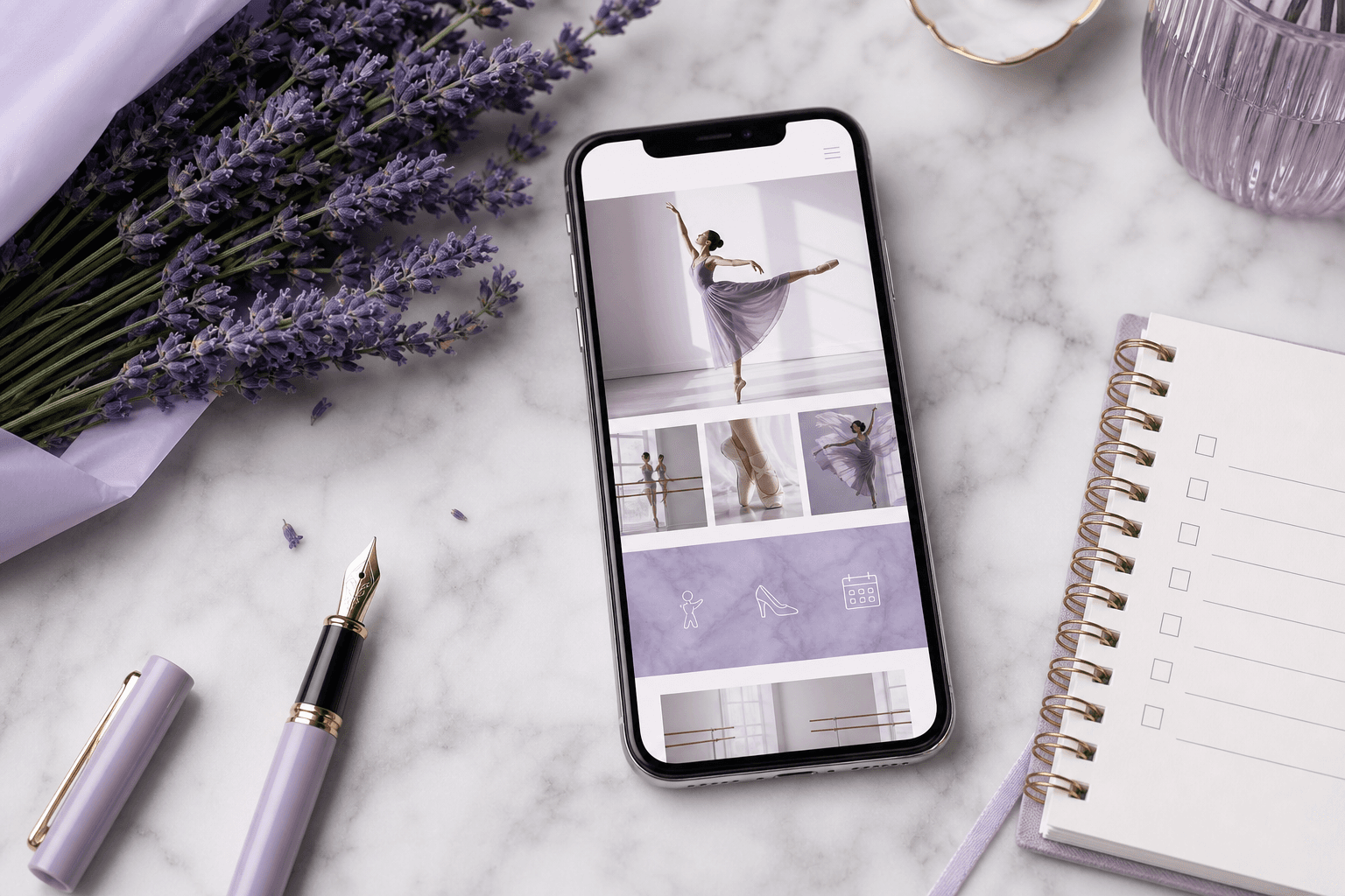
Nothing sells a studio like seeing real classes. Nothing kills a studio brand quite like a gallery of pixelated blurry images.

What to invest in
One annual shoot day
A professional photographer for 2 to 4 hours, capturing every class type. This is the single highest-leverage marketing investment most studios can make.
Short, vertical video
Fifteen to thirty seconds. Phone footage is fine if it is steady, well-lit, and parents have signed consent.
Photo and video checklist
- I have signed photography consent on file for every student shown
- Images are compressed and optimised for the web (under 300KB each)
- I have a mix of action shots, group shots, and warm portraits
- No photos older than 24 months appear on the public site
Chapter 11
Reviews and social proof.
A specific review from a real parent beats a thousand words of marketing copy. Use them everywhere.
Where to gather them
- Google Business Profile (the single most important review channel)
- Facebook reviews and recommendations
- End-of-term emails with a one-question prompt
- WhatsApp groups (with permission to quote)
How to use them well
- 01
Use first names and child's age
"Sarah, mum to Eva (7)" is twenty times more credible than "S. — Parent".
- 02
Pull out a short quote
Lift the strongest line into the page. Link to the full review.
- 03
Place them near decisions
Next to pricing. Next to the trial booking form. Next to class descriptions.
- 04
Show the rating
If you have 4.9 stars from 187 reviews, say so. Numbers are reassurance.
Reviews checklist
- I have at least 25 Google reviews
- I have a process for asking happy parents each term
- Reviews appear on at least three pages of the site
- The most recent review is less than three months old
Chapter 12
Pricing and policies.
Clarity wins. Hiding prices is a leak, not a moat.
What to publish
- Per-class or per-term pricing, plainly stated
- Sibling discounts and multi-class discounts
- Registration fee or membership fee, if any
- Costume and exam fees as estimated ranges
- Trial class price (or "free trial" if applicable)
Policies parents need before they enrol
Cancellation and refunds
Plain language. Two paragraphs, not a wall of legalese.
Term dates and absences
What happens if their child misses a class? Is there a make-up policy?
Photography and consent
How you handle images, what parents can opt out of.
Safeguarding
Named lead, qualifications, how concerns are handled.
Pricing page checklist
- A specific number appears on the page (even if it's "from £X")
- There is a clear "what is included" list per tier
- Policies are linked, not buried in a footer
Chapter 13
Contact.
Make it easy. Make it fast. Make it human.
The four ways to reach you
- 01
Phone or WhatsApp
For urgent or personal enquiries. Show hours of response.
- 02
Email
A real, monitored inbox. Not info@. Use a name.
- 03
A simple form
For people who prefer not to phone or email.
- 04
Address and map
Full address, embedded map, parking notes, public transport routes.
Reply-by promise
State, on the page, when you reply. "We reply to all enquiries within one working day." This single sentence converts more than any clever copy.
Contact page checklist
- My contact details are also in the site footer on every page
- The map shows our exact entrance, not a vague pin two streets away
- The phone number is a clickable link on mobile
- There is a clear reply-by promise visible on the page
Chapter 14
Blog and news.
Most studio blogs sit untouched for years. Done well, a blog is your single best SEO asset and the thing that builds the most trust.
What to publish (and how often)
- End of term shows and exam results
- "What to expect" guides (first ballet class, ISTD exams, summer school)
- Teacher spotlights
- Local content: dance opportunities in your town
- Practical answers to questions you get asked weekly
One genuinely useful post a month beats four rushed ones. If you cannot commit, do not start.
Blog post anatomy
- 01
One clear question or topic
"What to wear to your first ballet class" beats "Welcome to our blog".
- 02
800 to 1,500 words
Enough to be useful, not so much that nobody finishes it.
- 03
Photos from your studio
Every post. Generic stock kills credibility.
- 04
A call to action at the bottom
"Book a trial" or "Download our beginners guide".
Part Three
Technical & Launch
The invisible plumbing. The bits parents never notice when they work, and the only thing they remember when they don't.
Chapter 15
Mobile experience.
Roughly seven in ten visitors to your site are on a phone. Design for the phone first; the desktop will follow.
What to test on a real phone
- The headline fits without needing to zoom or scroll sideways
- The phone number is one tap to call
- The timetable is scannable without pinching
- Forms are usable with one thumb
- The site loads in under three seconds on a 4G connection
Cheap test
Hand your phone to a parent who has never seen the site. Ask them to find your timetable, then book a trial. Watch silently. Whatever they struggle with is your priority list.
Chapter 16
Speed and performance.
Every second of load time costs you trials. The data is not subtle.
The four wins
- 01
Compress your images
Single biggest fix on most studio sites. Aim for under 200KB per image. Use modern formats (WebP, AVIF).
- 02
Choose hosting that suits the job
Cheap shared hosting will throttle you on Saturday morning when everyone is booking. Decent hosting pays for itself in trials.
- 03
Remove what nobody uses
Old plugins. Slideshows. Auto-playing videos. Embeds from services you stopped using in 2021.
- 04
Test from a real device, not your home Wi-Fi
Use Google PageSpeed Insights and Lighthouse. Aim for 90+ on mobile.
Speed checklist
- Largest image on the homepage is under 300KB
- I score above 80 on mobile in Google PageSpeed
- I have no auto-playing video on the homepage
- I removed at least one thing from the homepage this year
Chapter 17
Local SEO for dance schools.
For most studios, "SEO" really means "showing up when a parent searches 'ballet classes near me'". That is a winnable game.
The five things that move the needle
- 01
A complete Google Business Profile
Photos, hours, services, weekly posts, replies to every review. This is bigger than your website.
- 02
Location-specific pages
If you teach in three venues, you need three location pages, not one combined page.
- 03
Specific class pages
"Ballet classes in [Town]" beats a single generic "classes" page.
- 04
Reviews, reviews, reviews
Recency and volume both count. Aim for one new Google review per month.
- 05
Local mentions
Be listed on the parish website, local mums groups, school newsletters, local press.
On-page SEO essentials
- Every page has a unique title tag including your location
- Every page has a meta description that would make a parent click
- Headings follow a logical order: one H1, then H2s, then H3s
- Image filenames and alt text describe what's in the image
- My site has an XML sitemap and is verified in Google Search Console
Chapter 18
Accessibility.
Accessible websites are not a tax. They are a kindness, a legal baseline, and almost always better designed.
The quick wins
- Contrast. Body text should easily pass against its background. Pale grey on white is the most common fail.
- Font size. 16px minimum for body. Bigger is fine.
- Alt text. Every meaningful image describes itself. Decorative images can have empty alt.
- Keyboard navigation. Every interactive element reachable with Tab. Visible focus rings.
- Form labels. Real labels, not placeholders that vanish when typing.
- Captions on video. Even short Instagram-style clips.
Why it matters
One in five UK adults has some form of disability. Many of them are the grandparents and parents booking and paying for your classes. An accessible site is simply a site that more people can use.
Accessibility checklist
- I have tested the site with a free tool like WAVE or Lighthouse
- I have used the site with the keyboard only and could still book a trial
- All form fields have visible labels
- Any videos with speech have captions
Chapter 19
Analytics and measurement.
You cannot improve what you do not see. Three numbers matter more than the rest combined.
The three numbers
Trial enquiries per month
The single most important number. Track it manually if you have to.
Where they come from
Google, Facebook, word of mouth, flyers. Ask every new family in their first email reply.
Conversion rate
Of the people who land on your trial page, what percentage submit? Aim for 8 to 15 percent.
Tools that don't get in the way
- Google Analytics 4. Free, the standard, harder to use than it should be.
- Plausible or Fathom. Privacy-friendly, simpler, paid.
- Google Search Console. Free. Shows what people search to find you.
- A spreadsheet. Often the most honest measurement tool in the studio.
Quarterly habit
Once a quarter, sit down with one cup of tea and ask: which pages got the most visits? Which got the most enquiries? Where did people leave? Change one thing. Measure again next quarter.
Chapter 20
Calls to action that work.
A call to action is a small button that quietly decides whether a parent enquires or scrolls on. They deserve more attention than they get.
What makes a CTA work
- 01
Specific
"Book my child's free trial" beats "Submit" or "Click here".
- 02
Visible
Brand colour, big enough to tap easily, not floating in a sea of similar-looking buttons.
- 03
Repeated
The primary CTA should appear on every page, at least twice on longer pages.
- 04
Low risk
"Book a trial" feels easier than "Enrol now". Match the size of the ask to where the parent is in the journey.
The CTA hierarchy
Primary
One clear action, repeated. Usually: book a trial.
Secondary
For parents not yet ready. Download a brochure, join the mailing list, see the timetable.
CTA checklist
- My primary CTA uses the same words everywhere
- The button colour stands out against everything else
- I have at least one CTA above the fold on every page
- The CTA on mobile is at least 44px tall (tappable with a thumb)
Chapter 21
Pre-launch checklist.
Before you press publish, walk through this. Ten minutes here saves embarrassing emails later.
Content
- Every page has a unique title and description
- No "Lorem ipsum" or placeholder text remains
- All images have alt text
- Copyright year in the footer is current
- Contact details are accurate everywhere they appear
Function
- Every form has been submitted as a test, and the email arrived
- The trial booking flow has been completed end to end
- Every link has been clicked. No 404s.
- Phone numbers are clickable on mobile
- Maps point to the right address
Technical
- HTTPS is on and the lock icon shows green
- Site has been added to Google Search Console
- Analytics is firing and you can see your own visits
- The site loads in under 3 seconds on mobile
- Cookie banner is in place if you collect any data
Chapter 22
Post-launch checklist.
The first thirty days after launch matter more than the previous three months of building.

Week one
- Announce the new site to your existing parent community by email
- Share screenshots and the link on every social channel
- Update the link in your Google Business Profile, Facebook, and Instagram
- Ask three trusted parents to walk through the site and report any oddities
Month one
- Review your top five pages in analytics. Anything underperforming?
- Check Search Console for any crawl errors or warnings
- Collect three new Google reviews
- Publish your first blog post on the new site
- Update one page based on what real visitors did, not what you assumed
Worksheet
Your 90-day action planner.
Pick the three things that will make the biggest difference in the next ninety days. Write them in. Stick this page above your desk.
The one big thing
The one big thing
The one big thing
Success looks like...
In ninety days I will know this worked because: